Influence Maps -a novel 2-D visualization of massive geographically distributed data sets
Bradley Huffaker, Marina Fomenkov, kc claffy
CAIDA, University of California San Diego
Introduction
As the Internet has become critical infrastructure penetrating many aspects of modern society, a better understanding of its behavior is of great interest to a range of fields from science to public policy. Characteristic patterns of Internet often vary with geography, and coherent study of these geographical trends is important to optimizing operations, engineering, and capacity and service planning. However, the massive volumes of data, and its wide geographic dispersion challenge common mapping and visualizing techniques. In this paper, we present a novel visualization technique – the Influence Map – which renders a compressed representation of geospatially distributed Internet data.
We apply this new technique to illustrate the behavior of a critical Internet service – specifically, the observed interactions between DNS root name servers and their clients. Efficient visualizations of these datasets reveal relationships between Internet services and users on a macroscopic scale and improve our ability to model geography-related Internet features.
1 Methodology
Many applications on the Internet employ a client-server model where clients requests service from a set of servers. Actual matching of clients and servers depends on multi-variable network dynamics (loadbalancing, routing choices, bottlenecks and latencies, etc.) and is difficult to predict, measure, and visualize.
Typical network visualization methods represent each client of a given server as a single dot on a geographic map [1, 2] and depict clients of different servers on the same map using different colors or symbol types. A combined map is legible provided that: (i) the number of sets is small; and (ii) set sizes are small, or (iii) sets exhibit strong clustering so a set’s geographic region stands out.
However, often the number of clients per server is large (many thousands) and their geographic coordinates are not necessarily tightly clustered. Too many points on a map overlap and obscure each other making it difficult to distinguish clearly among sets (Fig. 1).
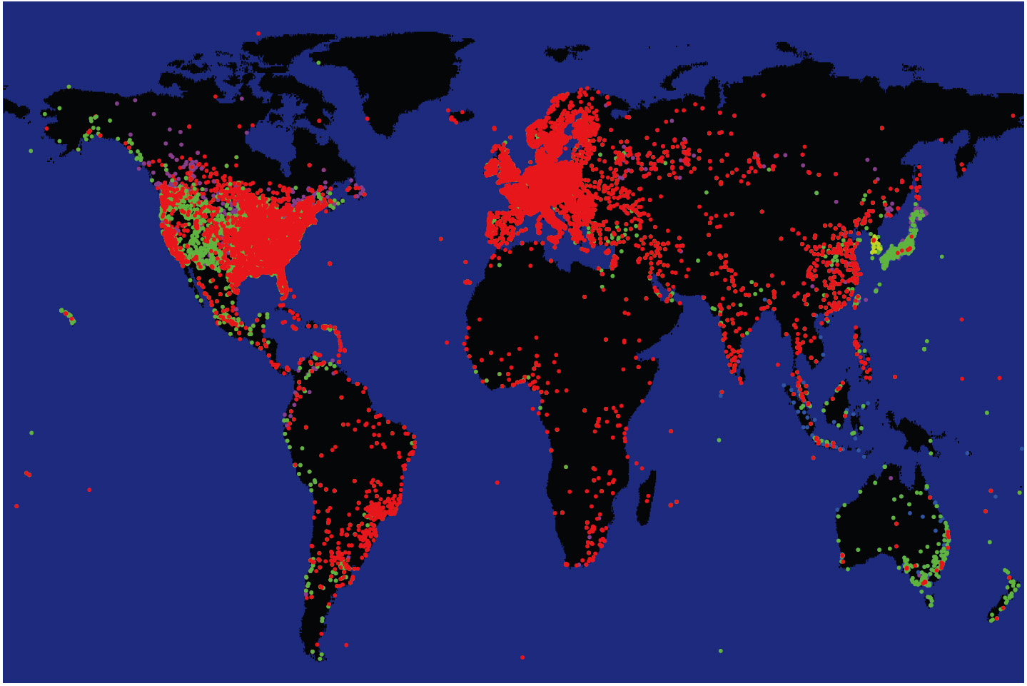 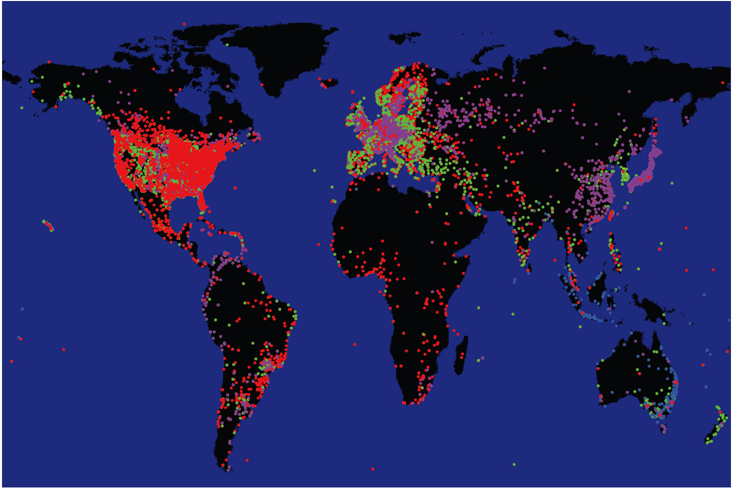 Figure 1: An example of cohesion loss and obscuration problem with dot graphs. We depict clients of DNS root servers [3] using colors to distinguish subgroups querying different servers. The two images use the same data set, but draw subgroups in a different order. The resulting views appear drastically different, distorting the true geographical coverage of each subgroup. |
We present a method to efficiently and usefully aggregate and visualize geospatially distributed data that characterize multiple servers serving worldwide population of clients. The visualization consists of two parts, the Location Map and the Displacement Map, and illuminates the geographic location of clients relative to the location of their server.
We consider clients of each server as a separate group (or set). The Location Map shows the centroid, or center of gravity, of each set and indicates the location of set members relative to their centroid. The Displacement Map shows the displacement of the set’s centroid from the geographic location of the set’s server. We next explain how each depicts relevant macroscopic aspects of DNS data.
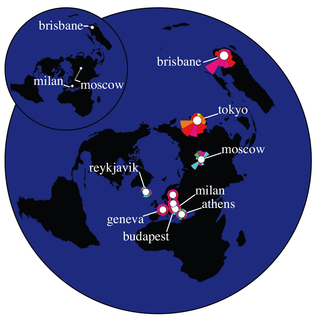
Location Map.
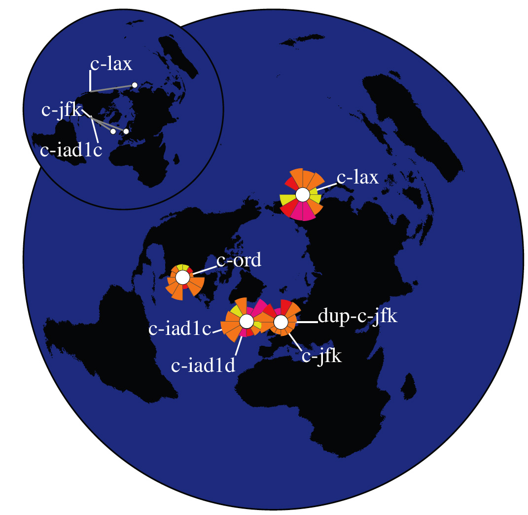
Since displaying each individual member at its true location overloads the map to the point of limiting utility (cf. Fig. 1), we instead display aggregated data sets. On our Location Map, each group of clients addressing the same server is represented as a circle surrounded by a group of wedges.
Figure 2 illustrates our technique. First, we calculate the coordinates of the point equidistant from all members of the set. This point represents the set’s geographic “center of gravity” or its centroid and becomes the center of the set’s circle. The size of the circle reflects the number of clients in the set.
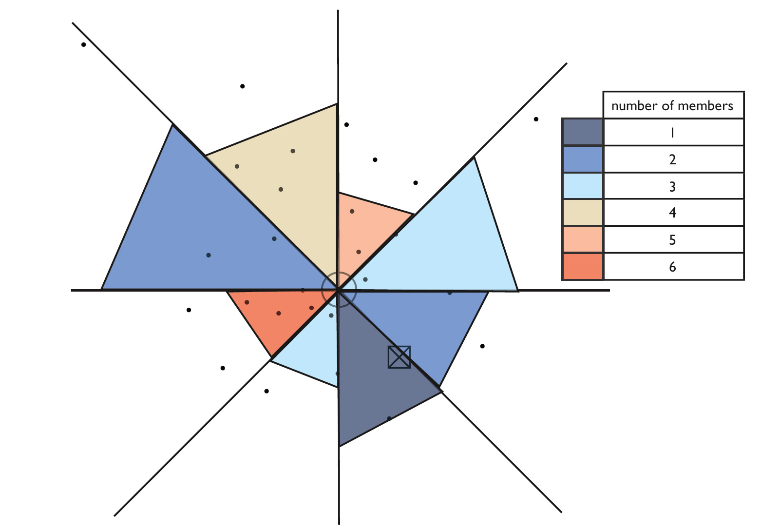 | Figure 2: Aggregation of data for a Location Map. Dots represent actual locations of set’s members. The circle is positioned at the geographic centroid of the set. The color of each wedge shows the number of members that lie in the geographic direction pointed to by that wedge. The length of the wedge from the center is proportional to the average distance of those members from the centroid. |
Next, we plot wedges to characterize the geographical distribution of set members. We divide the directional space around the set’s centroid into equal sectors, the number of sectors being a variable parameter. We found that using eight sectors optimized visual clarity of the DNS data; other data sets, or even other questions about this DNS data, might warrant a different sector granularity. For each sector, we draw a single wedge. The wedge color indicates the total number of group members (clients) that lie in the geographic direction pointed to by the wedge. The length of the wedge is proportional to the average distance from those members to the set’s geographic centroid. The proportionality factor is a variable visualization parameter chosen to avoid occlusion by overlapping wedges.
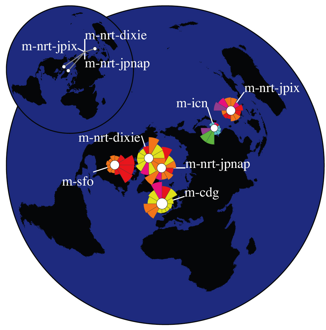
Displacement Map.
The Displacement Map complements the Location Map, pointing out cases where there is a noticeable distance between the location of a server and the geographic centroid of its clients. Figure 3 is an example of a Displacement Map for two DNS root servers located in Japan. For each server, a white line connects the text label naming this server to its true geographic location on the map. White circles mark the locations of the clients’ centroids. A gray ‘drift’ line connecting the actual location of each server with the centroid of its clients draws attention to cases where the disparity is significant. The shorter the drift line, the closer a server’s location is to the projected geographic center of its clients. To minimize clutter, the Displacement Map shows only the sets where the displacement is at least one pixel long.
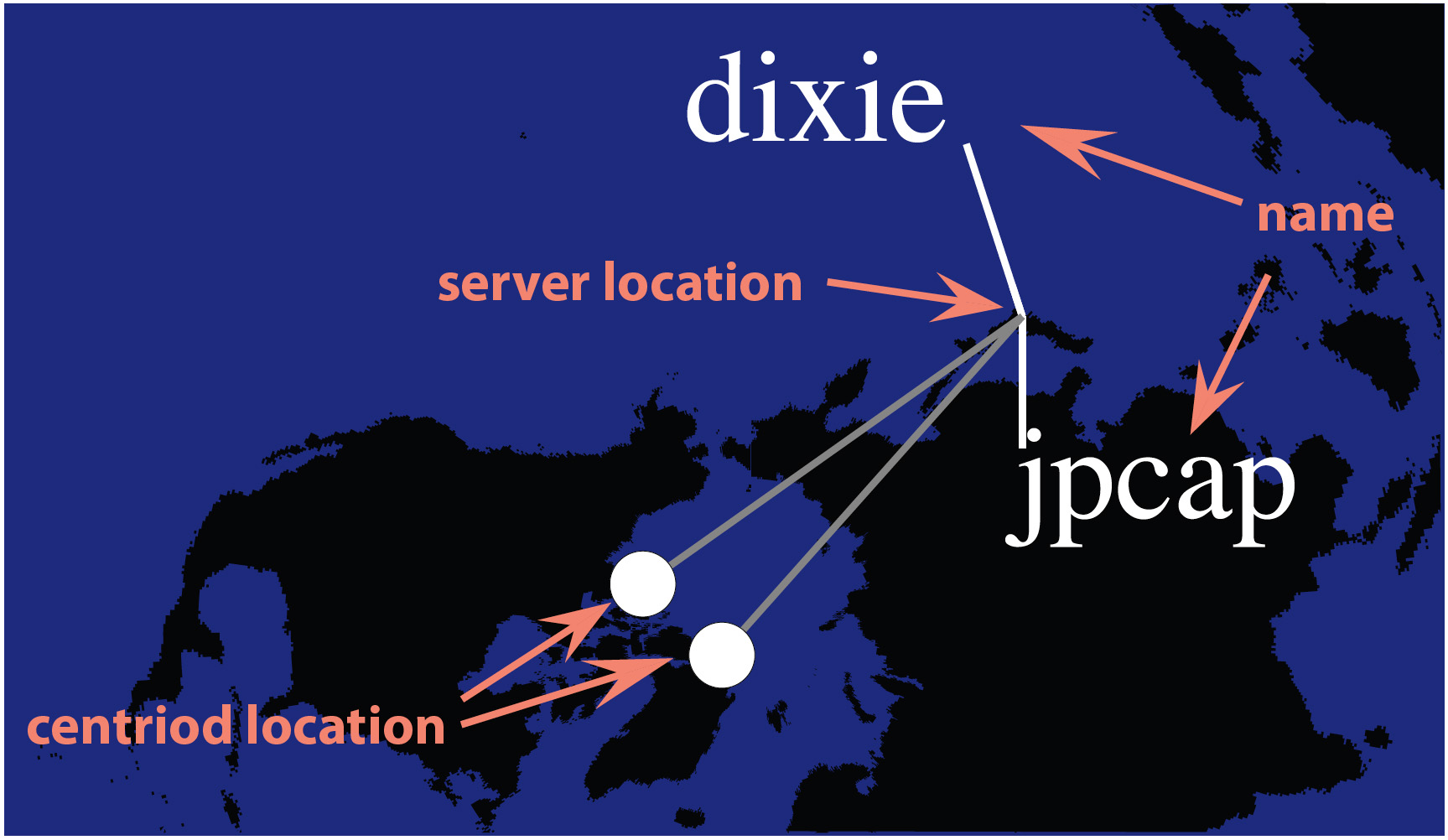 | Figure 3: Displacement Map. Large displacements are observed for two instances of M-root servers located in Japan. |
2 Visualization Examples – Influence Map for DNS root servers
In this Section, we present the influence map technique applied to visualize the worldwide population of clients querying DNS root servers.
Data. The Domain Name System (DNS) [3] is a fundamental component of today’s Internet, providing mappings between domain names used by people and the corresponding IP addresses required by network software. The original DNS design provisioned only 13 root nameservers, named by letters from A to M, to provide the bootstrap foundation for the global DNS database. Explosive Internet growth challenged this limitation and led several of the DNS root nameservers to deploy anycast technology. With anycast deployment, there are still only 13 IP addresses of the root servers, but each address corresponds to multiple physical instances of the given root server. A client still sends its requests to a single IP address, and the network routing layer, unaware that multiple machines have this address, chooses the shortest path to this address. Thus, the query is automatically routed to the nearest instance of the requested root server [4].
In 2007, 6 of the 13 root nameservers use anycast deployment, namely, the C, F, I, J, K and M [5]. Their anycast nodes are located all over the world to increase the geographic diversity of the roots and to shorten DNS response time. The anycast architecture of the roots also increases DNS system capacity and makes the system more resilient to DDOS attacks.
We collected packet traces [6] at anycast instances of the C, F, K, and M root servers as part of the Day In The Life of the Internet project [7] on January 9-10, 2007. We found geographic locations of all anycast instances in our dataset from [5]. To determine locations of observed clients, first we filtered out queries from bogon networks [8]. Next, for clients with valid IP addresses, we used the NetAcuity service by Digital Envoy [9] to map IP addresses to locations.
Visualization. We constructed an Influence Map for each root nameserver (Figures 4, 5, 6, and 7). The number of anycast instances in our dataset varies from 4 for C root up to 35 for F root. Clients of each anycast instance are aggregated and visualized as a separate group.
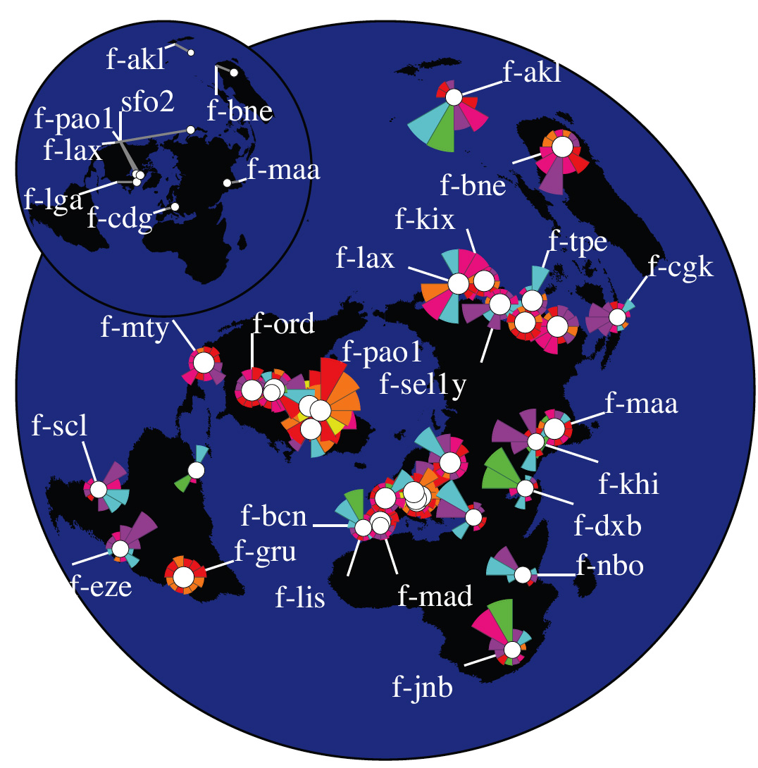
Latency in responding to client requests generally decreases when requests are routed to the geographically closest instance of a root server. However, the Internet routing protocol, Border Gateway Protocol (BGP), optimizes on criteria other than geography, e.g., service provider policies (based on economic and business realities) and then on routing path length. Attaining any gains in latency and stability are secondary effects from this optimization. Thus, at most anycast instances, we observe queries from clients from all over the world, rather than from just the local geographic region.
If all sets’ centroids were located in a relatively small region of the world, we could have approximated that small area of the globe as a flat 2D surface and could have used a straight distance-preserving projection to create our map image. In this case, directions would be preserved and the length of the drawn wedges would be proportional to the actual geographic distances. However, for centroids distributed around the globe, as the instances of the DNS root servers and their clients are, this simple approach does not work, and distortion will be induced somewhere when projecting from a 3D spherical to 2D plane. The polar projection centered on the North Pole minimizmes this distortion for the greatest number of clients since most of the world’s Internet users are in the Northern hemisphere where the distortion is minimal. At the same time, directional lines closer to the South Pole become curved and strongly distorted. If we constructed wedges (i.e., chose a sector on the map, identified clients that lie in this direction, and calculated average distance to those clients) in the original 3D space, the 2D projection of those wedges would be similarly curved and distorted. To avoid this confusion, we do all calcuclations directly in the projected flat 2D space on the map, so that the resulting wedges point toward corresponding parts of the world as positioned on the same map.
3 Conclusions
Although one of the Internet’s greatest strengths is its ability to obviate the problems of geographic distance, in reality, geographic considerations impact many operational decisions of Internet operators. A better understanding of the geographic distribution of clients using global Internet infrastructure and resources improves our ability to analyze existing and develop future policies regarding optimized locations of services. The volume of information describing hundreds of servers and millions of clients quickly renders simple techniques of geographic mapping of data ineffective. We developed influence maps to provide a unified, compressed representation of the geographic distribution of a networked system that facilitates analysis and comparison of different components of that system. Although our visualization method does not completely eliminate occlusion it does diminish its effects. Feedback from operators of root servers has already indicated that the DNS influence maps improved their understanding of the impact of anycast and helped guide their infrastructure investment decisions. This technique also seems promising for other data sets, including geopolitical and social, i.e., illustrating the constituence vs home state of candidates, or the fans vs geographic origin of movies, music, or religions.
Acknowledgments. We thank ISC, RIPE, Cogent, and WIDE for collecting the datasets used in this study. This work was supported by NSF Grant OCI-0427144.
References
| [1] | LAMM S. E., REED D. A.: Real-time geographic visualization of world wide web traffic. Proceedings of the Fifth International World Wide Web Conference (1996). |
| [2] | MOORE D., PAXSON V., SAVAGE S., SHANNON C., STANIFORD S., WEAVER N.: The spread of the sapphire/slammer worm. IEEE Security and Privacy (2004). |
| [3] | MOCKAPETRIS P.: Domain names -concepts and facilities. RFC 1034-5 (1987). |
| [4] | HARDIE T.: Distributing authoritative nameservers via shared unicast addresses. RFC 3258 (2002). |
| [5] | DNS root nameservers. http://www.root-servers.org/ |
| [6] | Tcpdump project. http://www.tcpdump.org/. |
| [7] | CAIDA: Day in the Life of the Internet project. http://www.caida.org/projects/ditl/. |
| [8] | TEAM CYMRU: Bogon Reference. http://www.cymru.com/bogons/. |
| [9] | DIGITAL ENVOY: NetAcuity. http://www.digitalenvoy.net/. |
Bradley Huffaker received his B.S. and M.S. in Computer Science from the University of California, San Diego. He is a senior researcher and programmer specializing in Internet data analysis and visualization. Bradley has been a member of CAIDA’s analysis team located at the San Diego Supercomputer Center for the last ten years during which he has coauthored over twenty publications. He can be reached at bhuffake@caida.org.
Marina Fomenkov holds a Ph.D. in Engineering and Data Processing Systems from Moscow Space Research Institute. She is a senior researcher specializing in Internet data analysis. Marina is leading the analysis of the DNS data collected during three annual DITL events. She can be reached at marina@caida.org.
kc claffy received her Ph. D. in Computer Science from UCSD. She is Director and a principal investigator for CAIDA, and an Adjunct Professor of Computer Science and Engineering at UCSD. kc’s research interests include Internet measurements, data analysis and visualization, particularly with respect to cooperation and sharing of Internet data. She advocates the use of quantitative analysis to objectively inform public Internet policy discussions. Her email is kc@caida.org.